May 27, 2020
13 Mobile UI/UX Best Practices and Principles for Great Application Design

Let’s talk about User Interface and User Experience in connection to mobile application design & development. It’s not a mystery good & on point UX is 70% of the success of a mobile product.
The UX can drive engagement to the application, optimize time to perform certain tasks, form habits, benefit people & add awesome gamification options to make sure your users would come back to the app on the daily basis.
That’s why good UX is so valuable on the marketplace – it’s pretty much the only reason you can distinguish with all the other countless applications out there (there are 5 million applications on both Apple Store & Google Play).
That’s why technology chose is so important part of any pre-development & pre-design analysis – the best UX can only be achieved using native development such as Swift for iOS & Kotlin for Android. It’s always a shame seeing people focusing on the UX for quite some time, trying to perfect every part of it in correlation with their market research, test group, core functionalities, etc. but simply picking the wrong cross-platform web-based framework which just can’t form the way its build show desired level of performance & user experience.
So, what kind of process are we using here at interexy to overcome all potential pitfalls that our clients might face here? First of all, before kicking off the design work we do lots of preparation. Before starting the design, we’d already had a mockups & wireframes outlining future user experience of the service – flows of different app modules, buttons locations, alerts, animations mockups, etc.
This description would already be tied up to the data we got from the client end regarding target audience, location-specific target market, the goal of the product & desired outcome. Believe me, application for pregnant woman & business app to perform p2p transactions should have way different user experience in place & it will specifically influence the traction that the service would get – in other words, make sure to perform as more preparation work as you can not to waste millions of marketing budgets.
After that, iteratively, basing on our data coming from specification, overview provided from the business analyst & designer pre-work with the mockups alongside our client vision we’ll kick off design development work.
We’re having several touchpoints through each week to make sure every member of the team is on track, our developers are checking out the design once a week before sharing the latest clickable prototype with a client to ensure from the development part everything is also on point.
With any new change from the side of our client, we’re providing our professional feedback coming from the experience working on similar products for similar target markets as well as a development point of view.
After the clickable prototype is finished, we’re sharing it with our internal test group (designers we work with) & they are providing us with different suggestions and perceptions on certain parts of a mobile product – this part really polishes the design bringing it to the perfect version of itself.
After clients’ approval, we’re ready to kick off the development. However, design work doesn’t stop at this point – it’s a constant process of improving, changing & reiterating on the product during the development & testing stages – it simply never ends and without continuous design support the product won’t meet current competitive market expectations.
Send me a direct message or leave a comment under this post if you’d like to see one of the recent designs we’ve built for a product that got to the top 17 of the German Health & Fitness section within 2 months after the release.
Table of content
- 13 Mobile UI/UX Best Practices and Principles for Great Application Design
- So, what are mobile UI/UX best practices?
- Follow Apple and Google Guidelines
- Maintain error-free functionality
- Intuitive app navigation
- Don’t make a mess with UI design
- Focus on readability
- A seamless experience across devices
- Finger-friendly tap bars
- Allow for a user personalization
- Create user assistance
- Make searching easy
- Include established features
- Offer feedback to customers
- Make a great first impression
- Consider Our Company Your Trusted Partner
- Final Thoughts
You won’t be surprised that well-thought-out & easy-to-follow UX is 70% of the success of a mobile product. That’s why dazzling UX is so valuable in the marketplace — it’s pretty much the only reason you can distinguish it from all the other countless applications out there (there are 5 million applications on both Apple Store & Google Play).
That’s why the technology chosen is such an important part of any pre-development & pre-design analysis — the best UI and UX can only be achieved using native development such as Swift for iOS & Kotlin for Android.
Unfortunately, many people focus on the UX and UI for quite some time, trying to perfect every part of it in correlation with their market research, test group, core functionalities, etc. However, they often pick the wrong cross-platform web-based framework, which just can’t form the desired level of performance & user experience.
Without a dedicated layout and understanding of your users’ in-app behavior patterns, you won’t have an opportunity to build a mobile product that will satisfy the main goal or exceed expectations. This article hopes to outline mobile app ui design best practices that will significantly improve the way your product works, seems, and is used by customers. Also, do not hesitate to contact our team to create an outstanding UX for your product.
Hire Developers
Let us choose the best specialist for you according to the project requirements so you can kick off the project within 5 business days!
Book a callSo, what are mobile UI/UX best practices?
UX implementation involves everything that can affect one’s perception and interaction with a product. Developing a mobile app based on user data eases the process of creating a design, which in turn leads to practical solutions to address actual user pain points. Below we have listed ten different strategies to integrate throughout the lifecycle of a mobile app to achieve outstanding UX.
1. Follow Apple and Google Guidelines
Keeping in mind that more than 74% of market share according to Q4 2021, Android OS and iOS head the global smartphone OS market, the first most obvious recommendation is to keep following Apple iOS Human Interface Guidelines and Google Material Design for Android as long as these platforms dominate over others available on the market.
Basically, this is a go-to option for every designer to start from. Even though this practice is common among all, designers sometimes contrive to disregard those essential rules, especially when it comes to similar design across iOS and Android platforms. In this case, the best way is to follow a happy medium as they do for Instagram, Facebook, etc.
2. Maintain error-free functionality
Unfortunately, the majority of app developers don’t focus enough on perfecting the functionality of this product with its users in mind and, thereby, end up with a faulty product. A survey published by Localytics reported that over 21 percent of mobile users drop off an app after the first use if the interface doesn’t deliver the experience they want.
When seeking implementation of mobile UX best practices, remember that the functionality of your product should be designed with a task the user needs to accomplish to achieve a certain goal. By offering relevant mobile-only functionalities will encourage customers to download your app rather than going to a website.

3. Intuitive app navigation
The UI UX best practices for mobile design include intuitive and friendly app navigation since it is essential for any mobile app that strives to achieve success among multiple products today. Create buttons that are clearly labeled with proper and easy-to-follow attributes. Try to avoid native phraseological units or jargon that users from different countries will not understand. Also, strive for consistency in the menu as categories should not overlap, allowing prospective users to go back to the main list easily.
Keep up with the mobile-first world!
Get in touch to build a multifunctional, user-friendly, secure mobile app for your business.
4. Don’t make a mess with UI design
Most mobile UI best practices advise developers to keep this interface clutter-free. Clearness is a crucial point for the perspective of your product, as cluttering with elements like images, key features, calendar, geolocate, and text will definitely overload user experience, making an app complicated and unable to use.
Such chaos is one of the enemies of any UI design. By keeping it straightforward and minimal, customers will follow the goal of your app clearly and concisely.

5. Focus on readability
Since today’s mobile devices come with small screens, even smaller than five years ago in some cases, and when compared to desktops, providing too much information in a tiny mobile UI will be a tricky task for any user.
That is why we advise you to keep short and easy to skim content as a common tip of the UX/UI mobile application design best practices. As statistics show, more than 73 percent of users don’t try to read and understand every word; instead, they focus on keywords and highlighted phrases. The readability and font chosen for an app should be prioritized during the whole process to offer a seamless user experience and satisfaction with every step.
6. A seamless experience across devices
Regardless of what type of device or website a user wants to connect with your app, the transition between all of them has to be seamless. The key design elements should come with similar colors to mirror each other. For instance, designers should avoid using orange for the app and black for the website.
7. Finger-friendly tap bars
Tab targets are usually located at the bottom of the screen, which allows customers to be conventional and quickly switch between all areas of your application. This commodity enhances inner navigation while saving space and improving the process of finding the needed features. In order to use them effectively, we recommend you to include no more than 3-4 tabs per screen and make sure they are big enough to easily tap them without additional effort. According to data collected on many websites, making a 10mm x 10mm button will be a gold middle size.
8. Allow for a user personalization
User personalisation is one of the key points in UX/UI best practices for mobile app design
that can improve the user experience. Going through the registration form, customers can personalize their goals, and you can create targeted content according to their needs and preferences. This practice can also be helpful in achieving marketing goals and making sure that eCommerce message sequences are written in the right direction.

9. Create user assistance
Almost in all mobile app UI design best practices, you will find that developers included responsive user assistance in case their users get stuck. Therefore, you need to ensure the assistance is there to support them and fix any problems that they may face.
10. Make searching easy
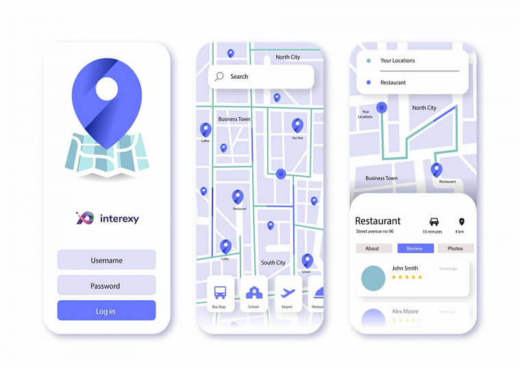
The latest research focused on best ux practices for mobile application found out that over 78 percent of users appreciate a search feature in all mobile applications since it could dramatically reduce their efforts. To provide customers with searching in a user-friendly way, try to put the button at the top of the screen to make it easily discoverable.

11. Include established features
This point is a great opportunity to cater to all user’s needs and desires. This is because all mobile designers should consider established features people already use daily on their devices. Things like swiping, zoom calls, or pinching have become common practice for most people today, so they should be employed whenever you can.
Also, in case you’ve decided to deviate from an established scenario, it’s vital to inform users of this deviation during the onboarding process.
12. Offer feedback to customers
Offering feedback to your user feedback on a mobile application is a crucial aspect for improved user experience. You can choose either animations or transitions as a great way to give feedback.
Although not so famous, audio feedback is also a possible option for mobile devices. However, we advise you not to rely on audio feedback because so many people keep their phones silenced for the whole day.
13. Make a great first impression
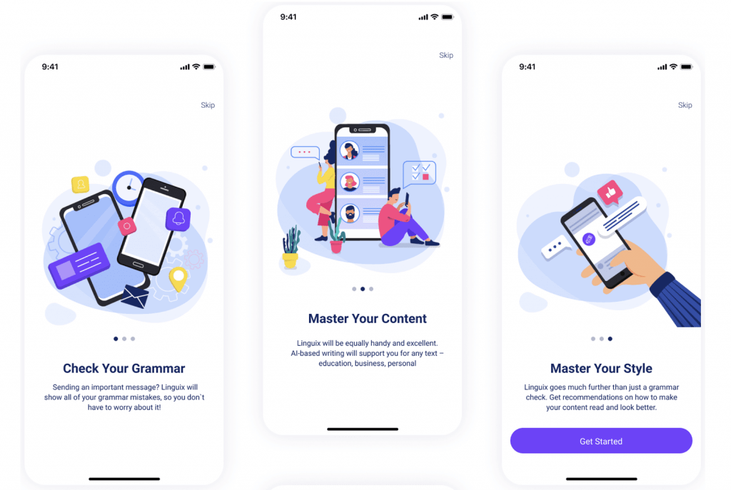
The last but not the least step in this mobile app UX best practices guide is making sure to offer a great first impression, as it will affect the whole user’s experience. If the prospective customer is satisfied with what he sees for the first time, your app is highly unlikely to get a second chance. Create an onboarding consistent, pleasant, and not long.
Consider Our Company Your Trusted Partner
Today’s UI UX design best practices for mobile applications are able to increase the chances that your app will be on the top of the list and be loved by users. We, at Interexy, have the most dedicated team of experts in the design industry that provide our customers with outstanding UI and UX for their products. We aim to implement the best UX practices for a mobile application during the whole development process to achieve success among numerous competitors.
It is safe to say our way is not as smooth as you may think, as we also face problems while creating something unique and trustworthy. For instance, when Scout’s founders came to us, they wanted us to develop a straightforward and high-speed app. It wasn’t a simple task, as the product was intended to be used by kids and parents. Thus, we needed to consider both parties during the designing process and offer an app that can be easily used by small kids without any problem but contains all crucial information and buttons to allow parents to track kids’ vitals.
However, following mobile app UI UX best practices, our designers created low-fidelity prototypes in the first place to show seamless & fast application flow while also ensuring both users can perform the desired action with the smallest possible amount of steps. Also, we kept the design as clean and consistent as possible without overflowing the product with unnecessary UI elements.
Interexy is a Miami-headquartered custom app development company with development offices in Dubai and Poland. We have in-depth expertise in Blockchain, Healthcare, Pharma & Fitness industries, offering innovative healthcare app development solutions for market giants such as SAP, Pampers, General Electric, and the fastest-growing web3 startups. As a team of app development experts, we always pay attention to the importance of UI/UX design in healthcare apps, building custom solutions that bring business value to medical organizations.
We will be happy to become your trusted partner in any challenge you take and help you produce a perfect product for your customers!
Book a Free Call!
Learn more about our expertise and get a detailed approach and solution for your specific case
Book a callFinal thoughts
There is a lot of advice and suggestions on how to design your app, so coming up with a unique product that ticks all the boxes could sometimes be a tricky task. However, applying the above mobile UX/UI best practices can significantly increase your chances of creating an app that attracts and engages your target audience.
We, at Interexy, are always here to answer all your questions, do not hesitate to consult our specialist! Also, if you are ready to create a successful app with dazzling design, our development and design team is already in the rocket and waiting for you.
FAQs
Why implement these mobile UX design process best practices?
The UX can drive engagement to the application, optimize time to perform certain tasks, form habits, benefit people & add awesome gamification options to make sure your users would come back to the app on a daily basis. That is why implementing these best practices mobile app UX/UI design of your product will be enjoyable and straightforward for prospective users.
What was your most complex challenge with UI?
Based on our experience, the most complicated task with the design we faced was with the MedKitDoc application. This is because the key differentiator in Healthcare is the UX of the product. Many brands develop functional telemedicine products, but they often lack clear & simple UX while also keeping the sophisticated design. Interexy’s team put this as a top priority during the design process.
Why choose Interexy?
When our customers come to us with unique needs and preferences, we choose each person to create a driving team with immense expertise in our customers’ sphere. Therefore, we ensure that your product will be developed by people who know the industry from scratch and bring your app to the target audience and attract as many customers as possible.


