Mobile applications in the healthcare domain play a role in improving healthcare services and facilitating communication between patients and healthcare professionals. According to Statista, the digital health market is anticipated to reach $511 billion by 2026. With this growth, it becomes crucial to understand the practices for creating user-friendly and effective UI and UX design in healthcare apps.
Investing in high-quality healthcare app design acts as a guiding light for innovation, driving the healthcare industry towards a future where technology prioritizes user friendliness and patient-centered approaches.
In this article, we will explore some of these practices that can help optimize the design of healthcare apps.
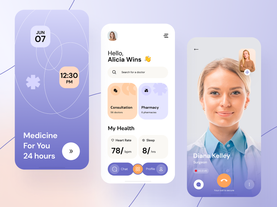
Understanding the Needs of Healthcare App Users
In crafting healthcare applications that truly resonate with the target audience, a deep-seated comprehension of healthcare app users’ necessities becomes pivotal. This understanding germinates from intensive user research, a process that gathers data from various touchpoints to gain insights into the users’ behaviors, preferences, and pain points. From this reservoir of information, personal development takes root, offering a structured and nuanced view of the diverse user base these apps serve. This facilitates the creation of tailored features and functionalities that align well with the users’ expectations and medical requisites.
Furthermore, user needs analysis acts as a beacon, guiding developers and designers to forge pathways that offer solutions that are not only innovative but also deeply empathetic to the users’ conditions and contexts.
In essence, honing in on the needs of healthcare app users through these strategic processes ensures a user-centric ecosystem where technology becomes a seamless and supportive ally in their healthcare journey.
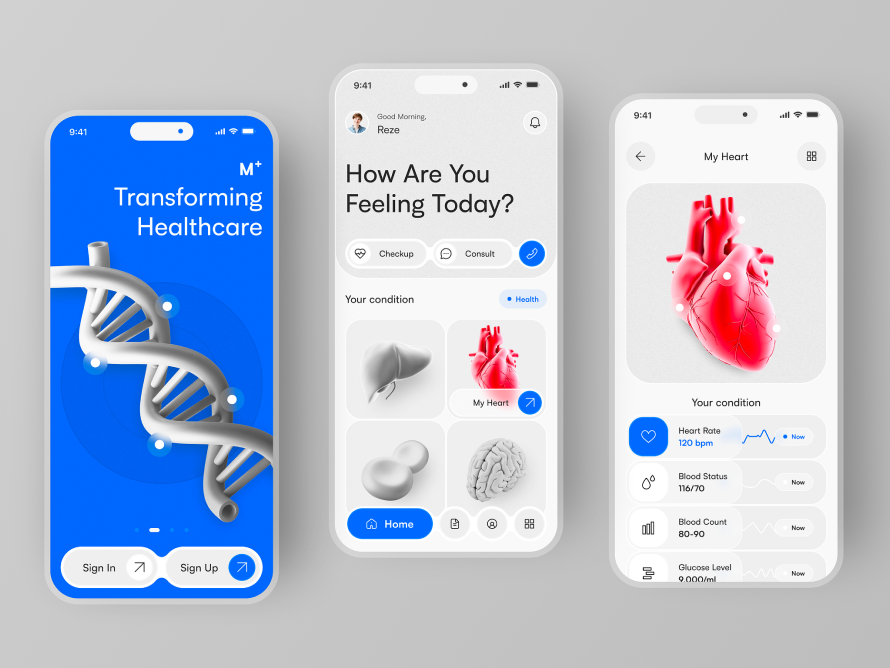
Simplicity and Intuitiveness: Designing a User-Friendly Interface
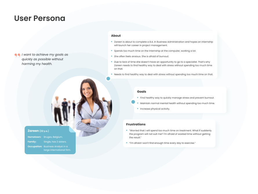
To create healthcare apps that truly resonate with the target audience, it is crucial to have an understanding of their needs. This understanding comes from user research, which collects data from sources to gain insights into the behaviors, preferences, and challenges they face. Based on this information, we develop personas that provide a nuanced view of the diverse user base these apps cater to. This enables us to create customized features and functionalities that align perfectly with users’ expectations and medical requirements.
Moreover, analyzing user needs acts as a guiding light for developers and designers as they navigate the path toward solutions that are not only groundbreaking but also empathetic toward users’ unique conditions and contexts.
In essence, by focusing on the needs of healthcare app users through these processes, we establish a user ecosystem where technology seamlessly becomes an ally in their healthcare journey.
Explore our Healthcare expertise and find out how Interexy can help you!
Book a call with our expertsPrioritizing Accessibility for All Users
In an age where digital health interventions are becoming commonplace, the emphasis on accessible medical app design has surged, underscoring the necessity for inclusivity in every facet of development.
Adhering to inclusive design principles means going beyond just a well-laid-out interface; it entails creating a digital space where individuals, irrespective of their physical or cognitive abilities, can access vital healthcare services without impediment.
Accommodating individuals with disabilities, be it through voice commands, screen readers, or easy-to-read fonts, should not be an afterthought but an intrinsic element in the developmental blueprint. It is through these conscious steps that an app can transcend boundaries, offering a level playing field where accessibility is not a privilege but a fundamental right. By prioritizing accessibility, healthcare apps can embody the true spirit of universal healthcare, nurturing a society that is both empathetic and forward-thinking in its approach to health and wellbeing.
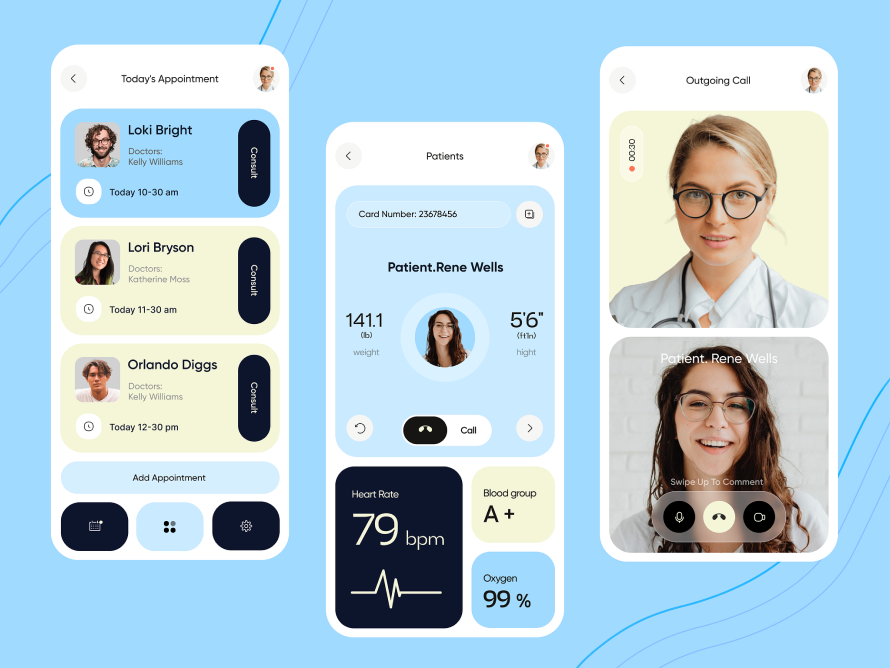
Captivating Visual Design Elements and Branding
Visual Hierarchy
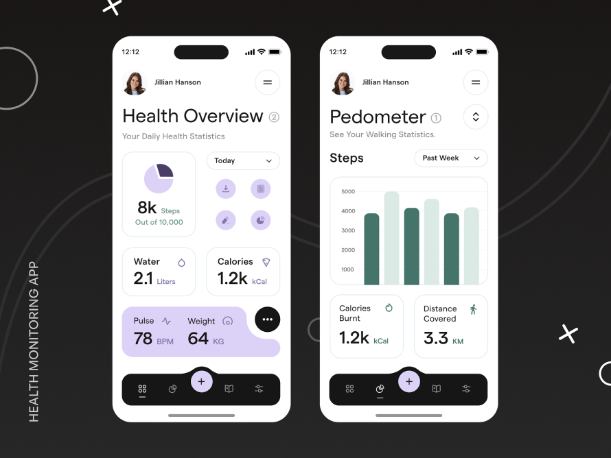
It’s crucial that users feel confident and protected when they open the healthcare app without being distracted by annoying visuals (needless to say, such types of visuals can impact those with visual impairments). Healthcare interfaces are typically designed to be minimalistic, clean, and simple to make them easier for users to navigate. A clear visual hierarchy is maintained, which guides the user through the screens and leads to the moment when one fulfills the task with which they came to the application.
Visual hierarchy is important in user experience in healthcare app design as it helps users understand and navigate the app easily. Effective use of color and typography can greatly improve visual hierarchy, guiding users through different elements and highlighting the most important information.
Color Scheme and Typography Choices
For healthcare applications, a positive vibe is very important. This unusual requirement comes from the essence of this software – to help people get treatment and set them up for recovery or maintaining health. A positive vibe helps users feel confident in the app and trust it more. It is created through the communication between the app and the user, and every detail is important here, from what fonts and colors are chosen in the UI-design to what tone of voice is used in the app.
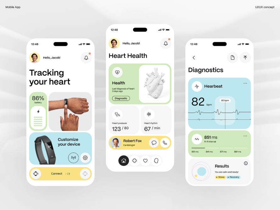
When it comes to color schemes in healthcare applications, it is important to consider that the best colors should be calming, stress-relieving, and anxiety-reducing. The choice is unlikely to be made in favor of the many bright colors that simultaneously exist on the screen.
Health-related topics tend to have a serious tone, and this should be reflected in the application. Blue and green colors are good because they have calming properties. We are talking here about calm shades that will not attract excessive attention from users (neon and overly bright solutions will not work).
In many cases, the topic of health is related to anxiety: people tend to feel anxious when it comes to their health. That is why the interface has an important task – to reduce this anxiety as much as possible, which is done through the understandable functionality of the application and its visual style. Colors such as white, blue, gray, green, and some shades of purple have a calming effect on the nervous system and create a medical app with a feeling of comfort and cleanliness, which helps reduce stress levels.
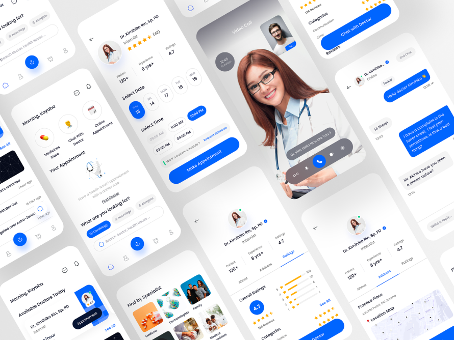
Typography is an often overlooked element that actually plays a big role in brand adoption and user experience, especially in healthcare applications where good text readability and legibility are a must.
Choosing the right font can speed up the user’s journey through the application, make navigation more intuitive, and communicate all the necessary information effectively and clearly. On the contrary, bad typography can greatly hinder the user’s journey and frustrate them.
Typography contributes to the overall aesthetic of a healthcare app, which in turn influences how users perceive the brand. A clean and modern font can convey a sense of professionalism and trustworthiness. Beyond aesthetics, the functional aspect of typography is central to the user experience.
Clear and legible text improves usability by reducing the cognitive load on users. Additionally, typography supports a visual hierarchy in the interface, directing users’ eyes to important elements and providing easy navigation.
There are a lot of best fonts for medical websites that are used in such software, and there is no specific and unambiguous solution, but they all generally follow the following rules:
- Sans serif fonts are most often used for screen readability.
- Preference is given to simple styles (not narrowed or widened).
- Maintains consistent typography throughout the interface: fonts are used consistently and consistently across all parts of the application.
- Font style should be functional: it should be legible on all screen sizes and in different contexts in the application, for example, on buttons, headings, or in long paragraphs of text.
- The size, contrast, and weight of the font should be related to each other and not be too small so that different users can easily distinguish words in the interface, which is why it is so important to optimize typography for different screen sizes, that is, to make it responsive. At the same time, it is important not to forget about accessibility for users with various visual impairments.
Branding Guidelines in Healthcare Apps
A consistent visual brand identity is essential for healthcare app branding as it helps users recognize and trust the app.
A cohesive visual brand identity creates a strong and memorable presence in the minds of users. This ensures that all visual elements work in harmony, reinforcing the message and mission of the app. A cohesive visual brand identity also contributes to a seamless user experience by making it easier for users to navigate the app and understand its purpose.
Brand consistency is critical to creating a strong and recognizable visual identity. To achieve this, healthcare app developers must ensure their visual branding is consistent across all touchpoints, including the app’s user interface design for healthcare applications, marketing materials, website, and social media channels. This consistency helps strengthen the app’s identity and establish trust with users, which ultimately leads to increased user engagement and adoption.
Data Security and Privacy: Building Trust through Transparent Design
Due to the sensitive nature of healthcare data, maintaining strict security measures is vital. UI/UX healthcare mobile app design should prioritize data privacy, ensuring that user information is protected at all times. Clear and transparent privacy policies, secure login procedures, and data encryption are essential elements to instill trust in users.
It’s important to know whether your business processes health data from users through the website or mobile app you’re developing. If you collect health data, you will need to adhere to stricter rules when handling personal data processed by your users, and your Privacy Policy should be updated accordingly.
There are 3 main scenarios in which personal data processed by health and wellness apps would be considered health data:
- Data that is clear or medical in nature.
- Raw data received by an application from sensors is processed by the application and can be used independently or in combination with other data to come to a conclusion about the user’s health status or potential health risks.
- Where conclusions can be drawn about the user’s health status or health risks based on the information collected by the application.
To ensure your website or app responsibly сollects health data, follow this checklist:
-
Obtain explicit consent for data collection, especially for processing users’ locations, unless it’s within a strictly medical context.
-
Clearly disclose the types of data being collected (personal and health) and how they will be used, ensuring compatibility and legitimacy in the processing reasons. This information should be easily accessible before app installation, prominently displayed in areas such as the App Store page and website footer.
-
Maintain transparency about data protection measures and any data amalgamation from various sources.
-
Clearly define terms in your Privacy Policy.
-
Implement risk mitigation strategies, including data minimization and privacy-by-design approaches, coupled with appropriate anonymization practices.
Incorporating Feedback Loops for Continuous Improvement
User Feedback Collection Mechanisms and Iterative Testing Processes
UI/UX design for healthcare is an iterative process that requires continuous improvement. Regularly seeking feedback from users, conducting usability tests, and analyzing user behavior can help identify areas for enhancement.
By embracing user feedback, healthcare companies can refine their designs and ensure they align with evolving user needs.
User feedback is invaluable in the design process as it allows designers to identify areas for improvement and refine their designs accordingly. Conduct user testing sessions and gather feedback on color and typography choices, making necessary adjustments to optimize visual hierarchy and overall user experience.
The best ways to collect feedback in the application:
-
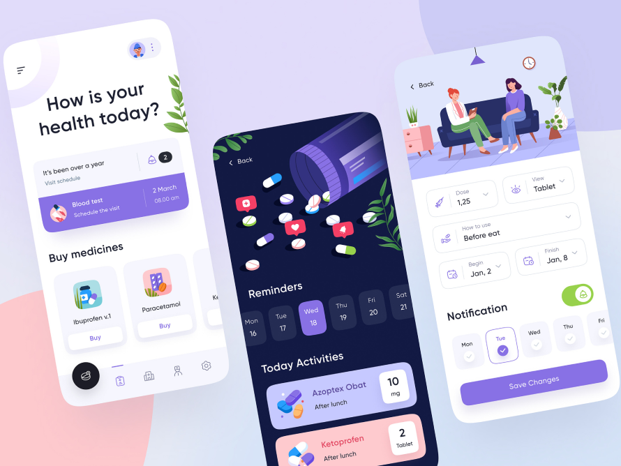
Live Chat
Incorporate a live chat in your healthcare app to facilitate real-time communication between users and your support team, enhancing user satisfaction and trust through prompt responses to urgent queries or concerns.
-
Surveys
Utilize customizable surveys within the app to gather specific feedback at critical touchpoints, like after consultations or accessing test results, to understand users’ satisfaction levels and opinions on various features.
-
Usability Testing
Conduct usability tests to gain insights into user behavior and preferences, aiding in refining the app’s interface and enhancing u ser experience based on task-based evaluations.
-
App Rating
Encourage users to rate your app, fostering not only feedback but also improving the app’s visibility and credibility in app stores.
-
Feedback Widgets
Install feedback widgets in the app to facilitate easy reporting of bugs or suggestions, fostering a higher likelihood of gathering necessary user insights by lowering the feedback entry barrier.
-
User Forums
Create user forums within the app to foster community discussions on features and issues, boosting engagement through collective feedback and a sense of community.
-
Focus Groups
Organize focus groups with actual users to attain qualitative feedback and deep insights into user needs and frustrations, which might not be captured through automated tools.
-
Push Notifications
Use push notifications to pose simple questions or guide users to in-app surveys, augmenting user interaction and feedback collection.
Every good app you’ve ever downloaded is a product of many rounds of testing. No product is ever perfect the first time around, or the second, or the tenth, and basically forever.
Testing and creating continuous iterations of applications is an excellent way to keep up with your customers’ needs. After all, trends come and go—what people prefer to do on their devices is also bound to change with time.
By involving users in the development process, healthcare app developers can create a more user-centric and accessible app.
The Role of Animation, Microinteractions and Gamification in Enhancing User Experience
Animated Onboarding Process
Animation contributes a huge benefit to the healthcare industry. Medical animation can convey important information to enhance communication with patients or explain a range of topics to medical students abroad. Besides the physicians, the patients also need animation in the medical field to thoroughly understand their health situations.
A good practice in modern healthcare apps is to use animated onboarding, which gently guides the user through the app and makes the onboarding process smoother and more convenient.
There are several principles that help make this type of onboarding most effective:
- Highlight essential features upfront to demonstrate the unique value of your healthcare app to users.
- Build user trust by ensuring data privacy and demonstrating the security measures in place, especially during the onboarding process. Be transparent about the necessity of personal information collection and provide access to the privacy policy.
- Incorporate a “back” button during the onboarding process to let users navigate freely and display the remaining steps to respect their time.
- Enable the option to skip parts of the onboarding process, allowing users some autonomy and fostering trust.
- Offer customization options, particularly in educational apps, to provide users with a personalized experience, leveraging the latest medical insights and expertise.
Microinteractions to Provide Feedback & Delightful Interactions
Microinteractions are small, subtle animations or medical app UI design elements that guide, inform, or reward the user. Examples include a button that changes color when clicked or a progress animation. They can make the interface more dynamic and interactive, provide feedback, guide users, or add a touch of excitement to the user experience.
Microinteractions perform the following functions:
- Communicate feedback or the result of an action;
- Accomplish an individual task;
- Enhance the sense of direct manipulation;
- Help users visualize the results of their actions and prevent errors;
- Create a more delightful experience;
- Make the interface more user-friendly.
Microinteractions perform the following functions:
- Action buttons;
- Fill in Forms;
- Confirming a Process;
- Notifications;
- Error alert.
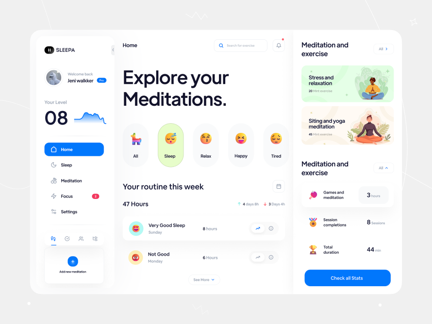
Gamification
Gamification involves the application of game mechanics in non-game settings to increase user engagement, motivation, and overall enjoyment. In healthcare apps, this might mean including scores, badges, leaderboards, challenges, or progress tracking. Gamification can make using a healthcare app more fun and rewarding, encourage positive health behaviors, and increase adherence to treatment plans.
Many apps incorporate gamification elements into some parts of them, especially when it comes to long-term commitment goals, and such solutions are appreciated by users. It’s often about creating little positive sparks in procedures that are usually considered boring, irritating, or painful. Gamification affects user retention rates and increases their satisfaction with using the application.
Explore our Healthcare expertise and find out how Interexy can help you!
Book a call with our expertsWrapping Up
In today’s world, where technology seamlessly integrates into every aspect of our lives, it is paramount to prioritize UI/UX in healthcare. A well-crafted interface not only simplifies navigation through complex medical information but also enhances patient engagement significantly.
It fosters a connection between providers and recipients by offering an intuitive and hassle-free journey rather than just transactional interactions. By combining UI and application UX design for healthcare as the foundation of app development, we can pave the way for more personalized, responsive, and efficient solutions in medical care.
This transformative approach will revolutionize how people perceive and access healthcare services.
