In today’s digital age, mobile devices have become the primary means of accessing the internet. As a result, designing and developing websites and applications with a mobile-first approach has become essential for businesses aiming to provide an optimal user experience. This approach not only ensures better performance and usability on smartphones but also leads to cleaner and more focused interfaces overall. This article will explore the benefits of mobile-first design and outline best practices to help you create compelling and engaging mobile experiences.
 7.49 billion
The number of mobile users worldwide is projected to reach 7.49 billion by 2025.
 59.57%
The global mobile usage market share accounts for 59.57% in 2024.
38.41%
The global desktop usage market share accounts for 38.41% in 2024.
What is Mobile-First App Design?
A mobile-first design strategy is an approach that prioritizes the mobile app user experience over the desktop experience when designing a website or a web app. This approach encompasses first creating the user interface (UI) and user experience (UX) for mobile devices and then scaling it to tablets and desktops.
Mobile-first design strategy gains popularity due to several factors. Firstly, smartphones are now the primary means of accessing the internet. Secondly, there are various existing restrictions of mobile devices that need to be taken into consideration, such as smaller screens, touch-based interfaces, and slower Internet speeds.
4 Benefits of Mobile-First Design
1. Improved User Experience
The mobile-first design prioritizes the needs of mobile users, who make up a significant portion of internet traffic. This approach includes optimizing core functionalities to the limitations of smaller screens, focusing on design responsiveness, ensuring simplified navigation, creating larger touch-friendly buttons and elements, and generating readable content without zooming in.
By focusing on smaller screens first, designers create streamlined, intuitive interfaces that enhance usability and engagement. This approach ensures that mobile users have a seamless and enjoyable experience, which leads to higher user satisfaction and retention rates.
2. Better Performance and Faster Load Times
Due to the constraints of mobile networks and hardware, designing for mobile first necessitates optimizing performance, responsiveness, and load times. This approach prioritizes minimalism and includes functionalities and content that are absolutely necessary. This results in leaner, more efficient websites and apps that load quickly, even on slower connections. Faster load times are critical for retaining users and reducing bounce rates, as delays can lead to frustration and abandonment.
3. Enhanced SEO and Decreased Bounce Rate
Search engines like Google prioritize mobile-friendly websites in their rankings. Mobile optimization means creating a responsive design, accelerating loading times, and ensuring mobile-friendly navigation. A mobile-first design ensures your site meets these criteria, improving visibility in search results.
High rankings and app marketing are vital for attracting more traffic, as users are more likely to click on the top links in search results. Additionally, a well-optimized mobile experience can reduce bounce rates, as users are more likely to stay and explore a site that loads quickly and functions smoothly on their devices.
4. Innovation and Growth
Adopting a mobile-first mindset encourages innovation by pushing designers and developers to think creatively within the constraints of mobile platforms. This can lead to unique solutions and new features that might not have been considered in a desktop-first approach. Moreover, as mobile usage grows, businesses prioritizing mobile-first design are better positioned to capture and retain a broader audience, driving growth and staying competitive in an increasingly mobile-centric market.
Let’s discuss how thoughtful design will help you attract and retain app users.
Let's talk
Interexy’s Best Practices for Creating Mobile-First Design
Simplify Layouts and Content
In mobile-first design, simplicity is vital. Streamline layouts to ensure they are clean and uncluttered, allowing users to focus on essential elements. Limit content to what is necessary and present it in a concise and straightforward manner. Moderate use of graphics and animations will help you enhance the content without overwhelming users and slowing loading times. This minimalistic approach not only enhances readability but also improves the overall user experience.
Prioritize Content
Use a hierarchical approach to display information and prioritize the most important content to ensure it is easily accessible on smaller screens. Designers make strategic layout choices to draw attention to crucial elements by placing them at the top and using different colors and sizes. This helps users quickly find what they need without excessive scrolling or searching.
Optimize Performance
Users expect quick access, seamless operation, and responsive web pages. To improve user satisfaction, optimize your app’s performance by minimizing the use of heavy images, videos, and other large assets or compressing them. Implement techniques such as lazy loading (initializing objects only when needed) and caching to enhance speed and accelerate page load times.
Web developers should also remove variable names, comments, and extra spaces to minimize code and markup in web pages. A fast-loading app is crucial for retaining users, particularly those on slower mobile networks and with low bandwidth.
Deliver Intuitive Navigation
Intuitive and easy-to-use navigation is vital for a seamless mobile user experience. Web designers break processes into steps and think through user flows to ensure effortless navigation. They employ familiar icons, clear calls-to-action, navigation drawers, and simple Hamburger menus or dropdowns. This helps display secondary elements of the web product, saving space and providing interactivity.
Mobile devices are touch-based, so you need to ensure that navigation elements are touch-friendly and designed with swipe, tap, and pinch actions in mind. Designers should make buttons and links large enough and easily tappable, avoiding the need for precision that can be challenging on smaller screens. Focus on spacing out interactive elements adequately and optimizing form fields for easy data entry.
Avoid Disruptive Pop-ups
Although pop-ups can be helpful and necessary (in the case of cookies settings), some users may find them annoying and leave your website. Therefore, avoid using disruptive pop-ups that can frustrate mobile users. If pop-ups are necessary, ensure they are easily dismissible and do not cover essential content. This helps maintain a smooth and enjoyable user experience without unnecessary interruptions.
Test on Real Devices Under Real Conditions
Test your mobile-first design on real devices and under various scenarios to understand how it performs in actual usage conditions. This includes testing on different screen sizes, device orientations, hardware capabilities, operating systems, and network conditions and speeds. Real-world testing helps identify potential issues and ensures your app delivers a consistent, high-quality user experience.
Incorporate user feedback to gather valuable insights regarding user behavior. In this case, you can adapt your design to align with user interests and preferences and create a truly functional and user-approved web product.
We will help you create a successful app from scratch or redesign the existing one!
Get in touchA 9-Step Process of Mobile-First Design Creation
-
Start with a Mobile-First Mindset
Begin the design process by prioritizing mobile users. First, focus on creating an intuitive and efficient experience for small screens, then progressively enhance the design for larger screens. This mindset ensures that the core functionality and user experience are optimized for mobile devices.
-
Conduct User Research
Understand your mobile audience’s needs, behaviors, and preferences. Conduct surveys, interviews, and usability tests to gain insights. This research will inform your design decisions and help create a user-centered experience that resonates with your target audience.
-
Define Core Features and Content
Identify the most important features and content for mobile users. Prioritize these elements to ensure they are easily accessible and functional on small screens. This step helps maintain a clear focus and prevents clutter in your design.
-
Create Wireframes and Prototypes
Develop wireframes and prototypes for the mobile version of your app or website. This allows you to visualize the design layout and flow, making it easier to identify potential issues early in the process. Use these prototypes to gather feedback and make necessary modifications.
-
Design for Touch Interactions
Ensure that all interactive elements are designed for touch inputs. Buttons, links, and other clickable items should be large enough for mobile users to tap easily without precision. This enhances usability and reduces frustration.
-
Optimize Images and Media
Optimize media files to reduce load times and improve performance. Use responsive images, compress files, and consider lazy loading techniques. This step is crucial for ensuring fast and smooth experiences on mobile networks.
-
Implement Responsive Techniques
While focusing on mobile-first, use responsive design techniques to ensure your site or app adapts seamlessly to different screen sizes. This includes flexible grids, media queries, and adaptive images. Responsive design provides a seamless transition from mobile to desktop.
-
Test and Iterate
Continuously test your design on various real devices and under different conditions. Collect user feedback and use analytics tools to identify areas for improvement. Iterative testing, app support, and refinement are critical to achieving a high-quality mobile-first design.
-
Focus on Accessibility
Ensure your design is accessible to all users, including those with disabilities. Follow best practices for mobile accessibility, such as providing text alternatives for images, ensuring sufficient color contrast, and enabling keyboard navigation.
How Can Interexy Help?
Interexy is a custom software development company specializing in building robust solutions for healthcare, FinTech, blockchain, and other industries. Our skilled UX/UI designers will help you create mobile apps and web products with captivating visual design elements and intuitive navigation to strengthen your brand. Check out our Behance and Dribbble company profiles for more app design ideas for becoming industry leaders.
Hire a dedicated team or augment your existing team with our IT specialists within 10 business days to kick off your project as soon as possible. From software developers and QA engineers to project managers and business analysts, our experts are ready to help you reach your goals.
Final Thoughts
Mobile-first design is a necessity in a world where mobile usage dominates. By prioritizing mobile users, businesses can ensure their websites and applications offer superior performance, usability, and engagement. Implementing best practices such as simplifying layouts, prioritizing content, optimizing performance, and testing on real devices can significantly enhance the user experience. As mobile technology continues to evolve, embracing a mobile-first mindset will keep you competitive and drive innovation and growth in your digital presence.
FAQs
-
Why is mobile-first app design important?
Mobile-first app design is crucial because it prioritizes the user experience on smartphones, the primary internet access devices. This approach ensures apps are fast, efficient, and user-friendly on smaller screens, enhancing accessibility and engagement. Additionally, mobile-first design often leads to cleaner, more focused interfaces, which can improve usability across all device types.
-
What is the difference between mobile-first design and responsive design?
Mobile-first design starts with designing for the smallest screen size and then scaling up, ensuring optimal performance and user experience on mobile devices. On the other hand, responsive design involves creating a flexible layout that adapts to various screen sizes and devices, starting from any device. While both approaches aim to improve device usability, mobile-first ensures the best mobile experience first. In contrast, responsive design focuses on fluidity and adaptability across all screen sizes from the start.
-
What are the main principles of mobile-first design?
Mobile-first design principles are aimed at creating seamless, intuitive, functional, and engaging user experiences for mobile users. Some of the principles are prioritizing content hierarchy, simplifying layouts, and ensuring touch-friendly interfaces.
-
What are the challenges of implementing mobile-first design?
Although the mobile-first design approach is vital for creating effective web products in today’s mobile-dominated world, certain associated challenges must be considered. For instance, designers need to find the right balance between simplicity and functionality, ensure cross-platform compatibility, and maintain aesthetic appeal across devices.
Related Articles

The Importance of UI/UX Design in Healthcare Apps
Creating effective and user-friendly UI/UX design for healthcare apps fosters a connection between providers and recipients by offering an intuitive and hassle-free journey.

6 Tips How To Create Women’s Health Tracking Application
Table of contents mHealth Applications Market OverviewFemTech as a Promising Direction for mHealth Apps DevelopmentFemTech Solutions Overview by TypesAdvantages of Women Healthcare Mobile Application Development6 Unobvious Tips for Female Health Mobile Application DevelopmentAdvanced Technologies in FemTech ApplicationsChallenges in Developing Women Health Tracking AppsHow Can Interexy Help?Final ThoughtsMost scientists agree that the human body has not […]

How to Create an EMR/EHR Software in 2023: The Ultimate Guide by Interexy
We all know that healthcare is one of the fields that undergo challenges thanks to COVID-19 and digitalization. Since technologies are everywhere now and people prefer to use software over calls and physical visits to hospitals, both companies and healthcare organizations understand the need for medical software development.
Related Cases
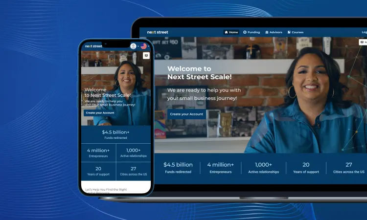
Next Street
Next Sreet is a Software-as-a-Service platform connecting small business owners across market sectors with the right experts to help them grow revenue, hire talent, and build wealth.
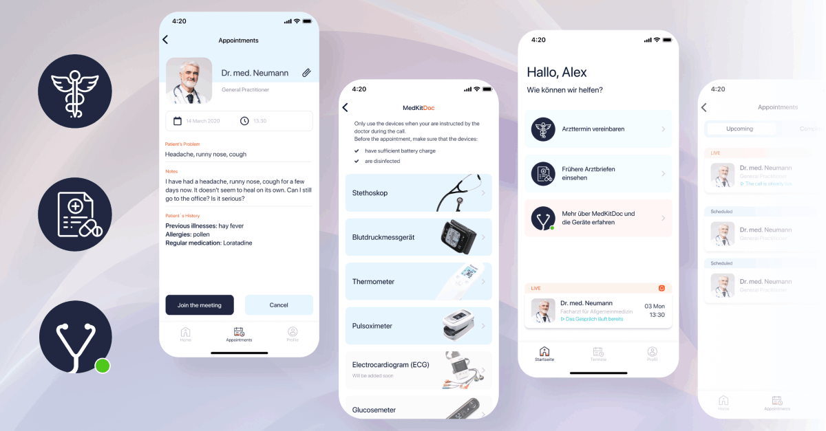
MedKitDoc
MedKitDoc is a revolutionary telemedicine product focused on B2B market with a concept of reinventing how telemedicine works – with innovative Bluetooth-based MedKits. The physicians that are using the service are capable of diagnosing 49 more diseases than through default telemedicine products.
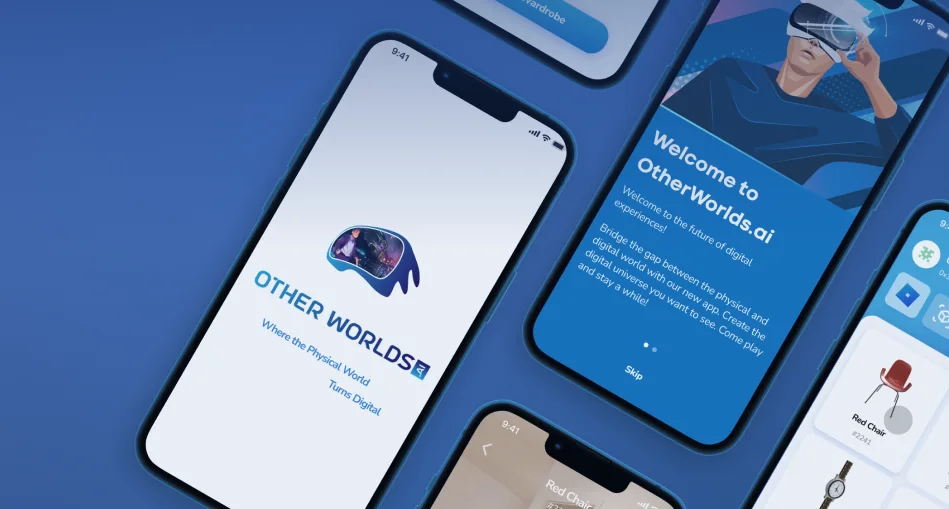
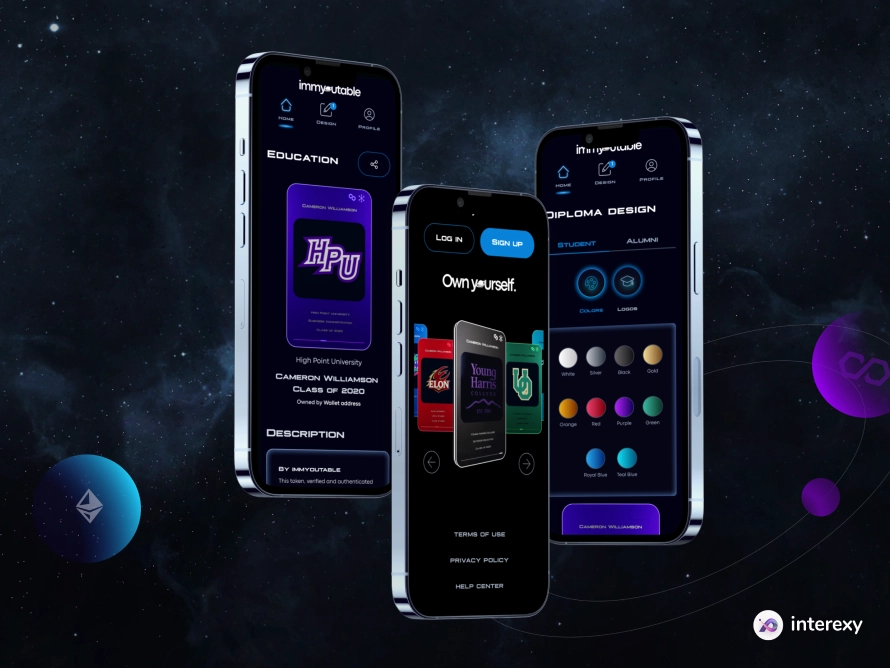
OtherWorlds.ai
OtherWorlds.ai is an iOS application allowing users to create immersive 3D and AR models from photos using photogrammetry, Lidar, and AI technologies.